Anyone who has ever released a corporate report knows the work that goes into it. Countless hours and resources compiling data, getting the design and copy just right, securing approvals, and sending it out to the world—it’s a hugely time-consuming and expensive task.
Now imagine that a large portion of the people you send that report to can’t even read it.
Visual impairments affect an estimated 2.2 billion people around the world who are either blind, have low vision, are dyslexic, or have other visual impairments. When it comes to both printed and digital materials of all kinds, the design and user experience choices we make affect the accessibility of documents, often in major ways.
Making reports accessible to everyone is a vital step that many companies overlook. Sure, some understand basic accessibility issues (like increasing type size), but there is much, much more that goes into making documents of all kinds more universally accessible—especially in the digital world where unseen tags, metadata, and navigation offer opportunities for significant accessibility improvements.
When you’re creating for digital distribution, the ways you can go about making a document more accessible are myriad. If you don’t understand all the options you have, not only could you waste time and money, (despite your best intentions) you could also end up with a document that may be unreadable to many.
So where do you start? A well-considered design plan before you begin is essential. If your report is digital, here are seven accessibility-related best practices to think through before you start working on your next project.
- Complete metadata such as title, author, and keywords to improve discoverability. Simply finding a document can be difficult for the visually impaired. Beyond just adding a title, including full metadata makes identifying the correct file much easier. It’s a low-effort step that is often forgotten about.
- Plan a clear hierarchy of information and make sure paragraph styles are tagged correctly. Content should have a delineated outline broken out into distinct sections. And when setting up a file, designers should pay careful attention to tags like H1, H2, etc. Steps like these, done before any writing or design even begins, can be key to accessibility success.
- Create color contrast between text and its background to meet WCAG 2.0 standards. For the visually impaired, seeing text clearly often comes down to differentiation more by contrast than by color. Read through the latest Web Content Accessibility Guidelines for recommendations on minimum contrast ratios based on the type of text, or try one of the many free online resources.
- Use navigation aids such as links, bookmarks, headings, and tables of contents. Creating clear, clickable ways to navigate a large report helps users better understand where they are in a document and make it easier for them to move from section to section. If you’ve properly outlined your content (see Point #2) this should be easy.
- Establish the correct tab/reading order so keyboard-only users can follow the right order of text and images. Given that visually impaired users often have difficulty seeing a cursor or navigating using slider bars, it’s important to ensure usability via the keyboard. When organized so the document flows correctly, keyboard-only movement through a document can be a big help.
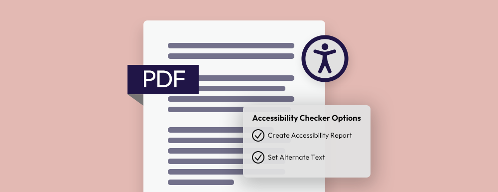
- Use image alt tags to add helpful text descriptions to non-decorative graphics and images. Users who take advantage of text-to-speech want to experience the images you’ve included, too. Adding tags to photos lets them “see” what they might otherwise miss. Be descriptive and give them a robust explanation of each photo.
- Add artifact tags to graphics, lines, shapes, etc., so they can be skipped by screen readers. The flip side to Point 5 above is that no one wants the flow of the document interrupted by text-to-speech announcing every unimportant line break, design element, or creative flourish. Tag them correctly and they’ll be skipped.
Ensuring your corporate reports and other documents are accessible to those with visual impairments not only makes your work inclusive and in compliance with ADA and WCAG guidelines, it also creates opportunities for improved usability and SEO performance. If you’re putting in the work so that your audience can read your report, make sure that audience isn’t limited because you didn’t properly address accessibility.
There’s even more that goes into making a document accessible for everyone. If you’re not sure where to start with your corporate reports, let’s talk.