
We admit that we may have been so busy working, pushing, and extending our clients’ brands that we may have neglected our own. It happens to a lot of creatives. You’re heads down, laser-focused on delivering great work, and the next thing you know, it hits you. The look and feel of your own brand doesn’t really look and feel like you anymore.
The Contrast DesignWorks brand launched with our company seven years ago, when it was just our founders (affectionately known as The Three Stooges), sitting shoulder to shoulder in a shoebox of a San Francisco office. Since then, our team, our areas of expertise, and our client roster has grown dramatically. So, when we thought about giving our brand a lift, we knew we wanted it to be an evolution rather than a rebrand—and yes, there’s a difference.
Brand evolution vs. rebrand
A brand evolution simply refreshes, expands, and improves upon who you already are. A rebrand is where you start from scratch—changing your look, feel, and personality completely. We’re still us—and we’ve built some good brand equity among our wonderful clients and partners. So, a strategic refresh was exactly what we needed.
Getting our team involved was really important to us. We’re in this together, and we were eager to get new perspectives and allow everyone a chance to flex their creative muscles. But we quickly realized that we needed to flex our project management muscles as well. Not everyone could work on everything—we needed to research, plan, delegate, and deliver.
A brand lift from light to heavy
We organized our brand refresh approach in three weights: light, medium, and heavy.
Logo (light): The split opacity of the “Contrast” and “DesignWorks” in our logotype was something we wanted to retain, but we took the opportunity to geek out on refining the letterforms and explored new fonts. Plus, we amped up the energy in our colors to adhere to our brand-new palette.
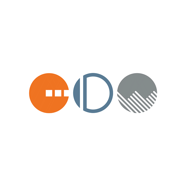
Bugs (medium): We liked the idea of having a symbol for secondary use cases—not locked up with our logotype, but instead as a separate brand element. Our refresh included expanding the “CDW” circles and aligning the shapes a bit more, using the same negative stroke across all three and unifying the shapes to be more solid. Now we’ve got a series of CDW circles, which we see as allowing us to interpret the same thing in different ways. Next step: We plan to animate the bug and visually connect the shapes as letters in our “CDW” story.
Sprites (medium): Showcasing our teams in a personalized way was an essential piece of our website refresh. The movement of the sprite is quirky and comical, giving us a fun way to highlight individual personalities and interests. Shot in black and white, each person’s photo got an extra pop or color with a layer of line art. We invested a lot of time here, on purpose, because our team is amazing. (Fun fact: Each person got the chance to come up with their own sprite story!)
Color palette, brand values, and website (heavy): We wanted to really rethink our new website in a way that reflected our agency—from the unique cast of characters to our enthusiasm for our work. Talking through what really matters to us as a team helped us have good conversations that ultimately informed our values—which evolved in both copy and our new illustrations. And for our energized color palette, we decided to go big or go home—putting bold, fun colors up front and center.

We’re pretty excited with the results. But even for a creative agency, a brand refresh can’t happen overnight. Juggling internal brand work while you’re focused on making things happen for clients is complicated, so for us, our brand evolution took about 9 months to complete (give or take). This is the first in a series of blogs about our evolution—because many of the lessons we learned could be very relevant to your own branding journey and employee engagement goals. Stay tuned!

